21.06.2026
From Spreadsheets to a Data Platform
Google Sheets are amazing.
They’re flexible, familiar, and incredibly useful. Given enough patience, you can build dashboards, reports, calculations, and even small applications inside them. Like many internal tools, our reporting system started there, and for quite a while, it worked remarkably well.
Then the project grew.
More advertising networks appeared. More campaigns were launched. More data had to be collected every day. More people started working with the same spreadsheets. One spreadsheet became several. Several became dozens. At some point, the spreadsheets were doing everything except making coffee.
This article is not about why Google Sheets are bad. They aren’t.
It’s about what happens when a solution originally designed to solve one problem gradually becomes responsible for solving ten.
In my previous case study, I described how I automated campaign monitoring and bid management for a large number of advertising campaigns. That project significantly reduced manual work and gave the team much better operational control.
Once that system was running reliably, a new question naturally emerged:
What if the biggest bottleneck was no longer campaign management, but the reporting infrastructure itself?
That question became the starting point for the next stage of the project: not another automation, but a complete redesign of how data was collected, stored, validated, and analyzed.
The System That Almost Worked
One of the easiest mistakes to make in engineering is to look at an old system and ask: “Who built this?” A much better question is: “Why did it make perfect sense when it was built?”
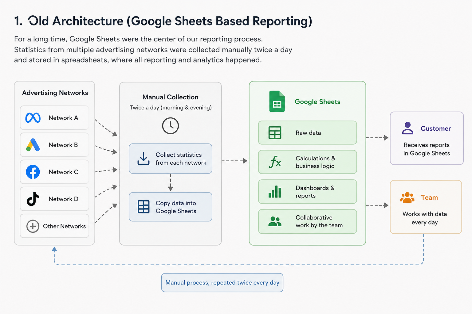
Our reporting process was actually a good example of a system that evolved naturally. Statistics from multiple advertising networks were collected twice a day and stored in Google Sheets. Over time, the spreadsheets became the central source of information for the entire team. Management dashboards were built there, colleagues worked with the data daily, and the customer also received reports in the same format.
There was nothing fundamentally wrong with this approach. In fact, it served us well for a long time. The problems only appeared as the project continued to grow. Every new advertising network added another stream of data. Every new campaign increased the reporting volume. Every new feature made the spreadsheets a little larger, a little slower, and a little more difficult to maintain. Eventually, collecting statistics became a routine task performed twice every day—including weekends.
I had already reduced much of this manual work by developing a local application that automated most of the collection process for our team. It saved a considerable amount of time, but it didn’t change the underlying architecture.
The system was still built around spreadsheets. At first glance, the obvious solution seemed to be full automation: collect the data automatically and push everything into Google Sheets. Problem solved.
Except it wasn’t.
The more I thought about it, the more it became clear that automating the existing workflow would mostly automate its weaknesses. The bottleneck wasn’t the people anymore. It was the architecture.
Why We Decided Not to Automate Google Sheets
The obvious solution seemed simple: automate the reporting process completely. Collect statistics from every advertising network on a schedule, write everything into Google Sheets automatically, and eliminate the remaining manual work. From a distance, it looked like the logical next step.
The more we discussed it, however, the less attractive the idea became.
Automating the wrong architecture only makes the wrong architecture faster.
The challenge wasn’t collecting the data. The challenge was trusting it.
Our reporting process had one important detail. Every evening, new statistics were appended to the reports, and the following morning those same records had to be updated with finalized numbers. That meant the pipeline had to distinguish between inserting new records and updating existing ones. A small mistake could easily create duplicate rows or overwrite valid data.
Technically, all of these problems could be solved.
But there was another issue.
Several people worked with the same spreadsheets every day. New formulas appeared, existing formulas were modified, and additional columns were added whenever someone needed a quick calculation. Google Sheets were no longer just storage. They had quietly become both the database and the application.
The more business logic moved into spreadsheets, the more fragile the entire reporting process became. Even routine maintenance started carrying unnecessary risk.
At that point, we realized something important.
The goal wasn’t to automate Google Sheets.
The goal was to move Google Sheets out of the critical path.
Instead of making spreadsheets smarter, we needed to build a system where spreadsheets were simply another consumer of reliable data—not the place where that data lived.
Choosing a New Architecture
Once we agreed that Google Sheets should no longer be the center of the reporting system, the next question was obvious: where should the data live instead?
Interestingly, the idea of introducing a database didn’t come out of nowhere. Another engineering team in our company had already gone through a similar journey. They started with MySQL, but as their datasets continued to grow, the database eventually became a bottleneck. The team later migrated to ClickHouse to handle analytical workloads more efficiently.
Our department processed several orders of magnitude less data, but their experience demonstrated something important. A dedicated database wasn’t an unnecessary complication—it was the natural next step in the evolution of a growing data platform.
Management supported the idea almost immediately and offered to provision a MySQL database for our team.
At first, we pushed back.
My colleague and I believed PostgreSQL would be a better fit. It offers excellent analytical capabilities, flexible data types, and is often the first choice for modern data engineering projects. Technically, our arguments were reasonable.
Operationally, they weren’t.
The response from management was refreshingly pragmatic. MySQL was already the company’s standard. The infrastructure was already in place, database administrators knew how to support it, and backups, monitoring, maintenance, and deployment were all part of existing operational processes.
“If you choose MySQL,” they told us, “the database can be ready almost immediately. If something goes wrong, the entire infrastructure team already knows how to help.”
It was difficult to argue with that.
We weren’t building a database for a résumé.
We were building a production system that other people would have to support.
Looking back, I still think PostgreSQL would have been an excellent technical choice. But choosing MySQL was the better engineering decision. Sometimes the best technology isn’t the one with the longest feature list—it’s the one your entire organization is already prepared to operate.
Within a short time, the new database was provisioned, and we finally had a clean foundation on which the new reporting pipeline could be built.
Building the Pipeline
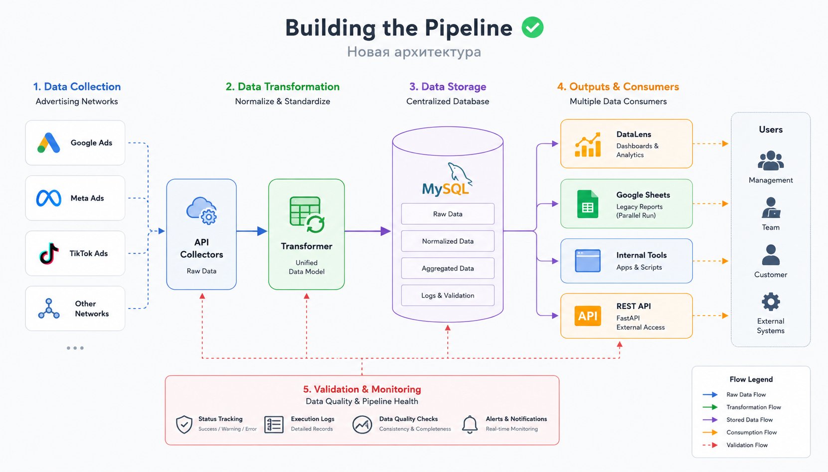
Once the database was ready, the next challenge was designing the data pipeline itself. The objective was straightforward: collect data from multiple advertising networks, transform it into a unified format, store it reliably, and make it immediately available for analysis.
Simple on paper.
Much less simple in production.
Rather than building a single application responsible for everything, I decided to split the pipeline into several independent stages, each with a clearly defined responsibility.
The first stage communicated with advertising network APIs and collected raw statistics. The second transformed incoming data into a common structure. Since different networks exposed different fields, naming conventions, and reporting formats, normalization became an essential part of the process. The third stage stored the processed data in MySQL.
Keeping data collection separate from transformation logic made the system significantly easier to maintain. When a network changed its API, only the corresponding integration needed to be updated instead of modifying the entire pipeline.
At this point, Google Sheets didn’t disappear.
Instead, they became one of the outputs.
This was an intentional decision. The existing reporting workflow continued to operate exactly as before, allowing both systems to run in parallel while the new architecture was being tested. Running the old and new approaches side by side dramatically reduced migration risk and provided an additional layer of validation.
Another important design goal was reducing unnecessary API requests. Previously, the local reporting application communicated directly with advertising networks every time statistics were needed. Once the database became the central storage layer, that workflow changed.
The server collected the data once.
Everything else—including local tools, reports, dashboards, and future integrations—worked with the database instead.
This approach reduced API traffic, improved response times, and established a single source of truth for the entire reporting system.
The architecture was still evolving, but the foundation was finally in place.
DataLens Wasn’t the Goal
At this stage, we finally had something we had never had before: a centralized, structured, and continuously updated dataset.
Only then did it make sense to think about visualization.
DataLens wasn’t the reason we built the new architecture. It was a consequence of having reliable data.
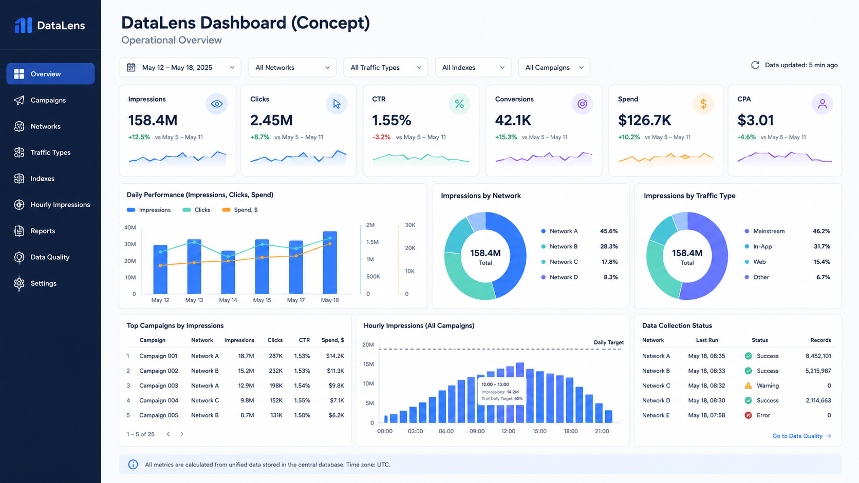
The first version of the dashboard was intentionally conservative. It reproduced almost everything that already existed in our Google Sheets reports. The goal wasn’t to introduce new visualizations or additional metrics.
It was to prove that the new data platform produced exactly the same business results as the existing reporting process.
Once that confidence was established, the real improvements began.
Because all data was now stored in a relational database, creating new reports became dramatically easier. Instead of adding more formulas to already overloaded spreadsheets, we could build dashboards directly on top of normalized data.
Over time, the dashboard evolved far beyond its original purpose. We introduced breakdowns by advertising network, campaign-level analytics, traffic type segmentation, and performance metrics grouped by internal indexes.
Perhaps the most valuable addition was hourly impression reporting for every campaign.
That report quickly became one of the team’s primary operational tools. Instead of simply checking whether campaigns reached their daily impression targets, we could now see when they reached them.
This seemingly small detail turned out to be extremely useful.
If a campaign exhausted its daily budget by noon while still meeting its impression target, it often meant we were bidding more aggressively than necessary. Lowering the bid allowed impressions to be distributed more evenly throughout the day while reaching the same target at a lower cost.
The automated campaign monitoring system described in my previous case study handled impression limits automatically. The new dashboard provided the missing context needed to optimize bidding strategy.
Together, these two systems complemented each other remarkably well.
One executed operational decisions automatically.
The other helped us make better decisions in the first place.
Looking back, that’s probably the biggest lesson from this stage of the project:
Dashboards don’t create insights. Well-structured data does.
The dashboard simply makes those insights visible.
The Unexpected Discovery
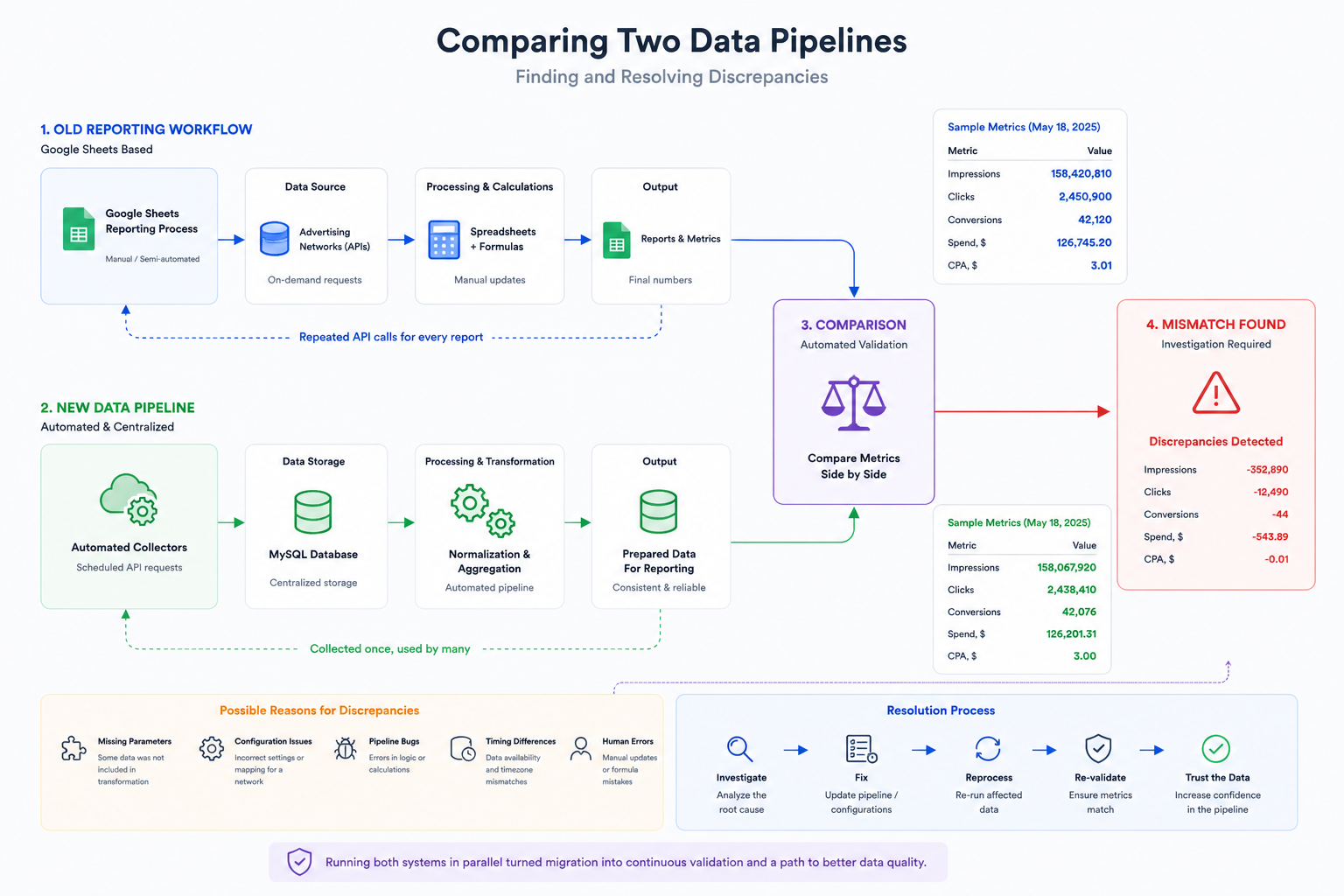
By this point, we had no intention of replacing the existing reporting process overnight. Instead, we allowed both systems to run side by side.
The original workflow continued producing reports exactly as before, while the new pipeline independently collected the same data, processed it automatically, and stored it in the database.
The plan was simple.
If both systems produced identical results over time, we could confidently move forward with the migration.
Then something unexpected happened.
The numbers didn’t always match.
Not often.
But often enough to make us uncomfortable.
At first, it was tempting to assume that one of the systems was simply wrong.
The reality turned out to be much more interesting.
Some discrepancies were caused by configuration mistakes. For example, after connecting a new advertising network, one of its parameters had not been added to the transformation stage. The raw data was collected successfully, but part of it never reached the final reporting tables.
Other differences exposed bugs inside the pipeline itself. In a few cases, the discrepancies originated from the existing reporting workflow rather than the new one.
Without running both systems in parallel, we probably wouldn’t have discovered any of these issues.
Ironically, the migration process became one of the most effective testing tools we could have built.
Every mismatch was treated as a signal rather than a failure.
Instead of asking:
“Which system is correct?”
we started asking:
“Why are they different?”
That small shift in perspective transformed the migration into an ongoing validation process. Each discrepancy improved the quality of the pipeline, and every resolved inconsistency increased our confidence in the data.
Looking back, running both systems in parallel wasn’t just a safer migration strategy.
It became one of the most valuable engineering decisions in the entire project.
Validation Became Part of the Architecture
Running both systems in parallel revealed something we hadn’t anticipated.
The pipeline didn’t just need to collect, transform, and store data. It also needed to continuously prove that the data could be trusted.
Validation was no longer a debugging tool.
It became part of the architecture.
Every interaction with an advertising network already returned more than just business data. Each request also produced a status describing the result of the operation:
- Success — the request completed successfully and the data was considered valid.
- Warning — the request completed successfully, but no statistics were returned. This wasn’t necessarily an error; sometimes there were simply no active campaigns in a particular network.
- Error — the request failed and required investigation.
Instead of hiding these states inside application logs, we decided to expose them.
The pipeline started writing execution information into dedicated log tables, while DataLens displayed the current health of the data collection process in real time.
For the first time, we could answer two completely different questions independently:
- What does the business data say?
- Can we trust the business data?
Those are not the same question.
A dashboard can display beautiful charts while quietly relying on incomplete, outdated, or partially collected information. By making validation visible, we gained confidence not only in the numbers themselves, but also in the process that produced them.
The validation layer is still evolving. Today it focuses primarily on API responses and data collection, but the long-term goal is to extend the same level of monitoring to every stage of the pipeline—from data transformation and loading to downstream processing and reporting.
Reliable data pipelines are not built by eliminating failures.
They are built by detecting failures early, making them visible, and ensuring they cannot go unnoticed.
Where the Project Is Today
The migration is still in progress.
That may sound surprising after everything described above, but large engineering projects rarely move from one architecture to another overnight.
Today, both workflows continue to operate in parallel. The existing Google Sheets-based reporting process remains the official method for delivering statistics to the customer, while the new data platform is already being used internally.
The server collects statistics automatically. The database acts as the central storage layer. DataLens provides operational dashboards, and local tools now retrieve prepared data directly from the database instead of repeatedly requesting information from advertising network APIs.
The final step is replacing the customer-facing reporting workflow.
To make that possible, I developed a REST API using FastAPI that allows external systems to retrieve reporting data directly from the new platform. The API has already been completed and handed over to our infrastructure team for deployment. Once it becomes part of the production environment, the remaining dependency on Google Sheets can finally be removed.
Until then, the parallel architecture serves another important purpose. It allows us to continue improving the platform without disrupting the existing reporting process. New reports can be added, validation rules can be expanded, and the pipeline can continue evolving while every change is verified before becoming part of the official workflow.
Looking back, I no longer think of this project as “moving data from Google Sheets into a database.”
It became something much bigger.
It was a gradual transition from a collection of useful tools into a reliable data platform.
The technology mattered.
The dashboards mattered.
The automation mattered.
But the most valuable outcome was something less visible:
A system that the team could trust.